Here are some of the points, described in simpler language with the changes proposed but not yet approved (for the exact wording review http://www.access-board.gov/):
- Mounting Location and Height. Raised and Braille characters are required on signs that "designate permanent rooms and spaces." This is intended to cover signs typically placed at doorways (i.e., room and exit labels) because doorways provide a tactile cue in locating signs. (Other types of signs that can be placed variously along circulation routes may not be easily found by people with little or no vision.) The requirement for raised and Braille characters also applies to signs labeling rooms whose function (and thus designation) is not likely to change over time. Examples include signs labeling restrooms, exits, rooms/floors by number or letter.
The signs shall be installed on the wall adjacent to the latch side of the door. Where there is no wall space to the latch side of the door (including at double leaf doors), signs shall be placed on the nearest adjacent wall. Mounting height shall be 60 inch above the finish floor to the center-line of the sign. The horizontal distance of the sign from the door should be so the sign reader must be able to approach the sign within 3 inches without encountering an obstacle or being hit by the swing of a door. In other words, the edge of the sign should be within 3 from the door, so long as there is no obstacle in the way.
Changes proposed: Tactile characters on signs shall be located 48- 60 from the finish floor to the baseline of the tactile characters (as opposed to the center-line). The original 60 height was reduced to accommodate handicaps using a wheelchair.
- Choosing a Location. What about signs that are not identifying rooms? Try to place the signs in places they will be observed easily. Landmarks that can easily be distinguished by visually impaired individuals are useful as orientation cues. Such cues include changes in illumination level, bright colors, unique patterns, wall murals, location of special equipment or other architectural features.
Many people with disabilities have limitations in movement of their heads and reduced peripheral vision. Thus, signage positioned perpendicular to the path of travel is easiest for them to notice. People can generally distinguish signage within an angle of 30 degrees to either side of the centerlines of their faces without moving their heads.
- Raised Letters. The raise characters (letters and numerals) shall be at least 5/8, but not higher than 2, and they shall be raised 1/32 minimum. The fonts used are upper case, sans serif or simple serif type of a non-decorative nature. No condensed or extended fonts are allowed. Strokes are of medium weight, not too bold or too thin.
The legibility of printed characters is a function of the viewing distance, character height, the ratio of the stroke width to the height of the character, the contrast of color between character and background, and print font. The size of characters must be based upon the intended viewing distance. A severely nearsighted person may have to be much closer to recognize a character of a given size than a person with normal visual acuity.
Changes proposed:
- only sans serif fonts will be allowed (simple serif fonts like Helvetica Medium, Helvetica regular, Avante Garde Demi Condensed, Times Roman, Futura Bold, Futura Regular, Goudy Bold, Optima Regular and Optima Semi Bold will be forbidden).
- The letters can be uppercase, lowercase or combination of both (as opposed to uppercase only).
- Braille. The Braille used should be Grade II Braille placed below or beside the raised characters. Consistency within a building system is the important thing. If placed below (flush left or center), it is important that it be spaced far enough away from raised characters (and borders) so that fingers can be flush with the sign face. The current regulations do not specify the distance from other raised elements but the new proposed guidelines ask for a minimum of 3/8 between tactile elements, so it is wise not to space them closer than that.
Grade II Braille is different from literary Braille by using standard word contractions. A character symbol is used to distinguish numbers from letters since the same characters are used for both. Similarly, a character symbol is used to indicate capitalization. Recommendations: Capitalization should be used for the first letter of proper nouns and names but not for "restroom" or "exit." Unlike raised letters, Braille is not provided in all caps (which would require the capital symbol before each letter).
Dot diameter: .059 in.
Inter-dot spacing: .090 in.
Horizontal separation between cells: .241 in.
Vertical separation between cells: .395 in.
Changes proposed:
- Braille dots shall have a domed or rounded shape
- Braille shall be positioned below the corresponding text. If text is multi-lined, braille shall be placed below the entire text. Braille shall be separated 3/8 inch minimum from any other tactile characters and 3/8 inch minimum from raised borders and decorative elements.
- Pictograms. Pictograms shall be accompanied by the equivalent verbal description placed directly below the pictogram. The border dimension of the pictogram shall be 6 minimum in height.
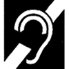
There are four pictograms that stand for accessibility:
| |
a. The familiar International Symbol of Access, or "wheelchair symbol." It's used generally to show that persons with mobility impairments can access entrances, restrooms, or pathways. |
|
| |
b. Volume Control Telephones. Telephones required to have a volume control shall be identified by a sign containing a depiction of a telephone handset with radiating sound waves. |
|
| |
c. Text Telephones. |
|
| |
d. Assistive Listening Systems. |
|
- Borders. Raised borders around signs containing raised characters may make them confusing to read unless the border is set far away from the characters.
- Finish and Contrast. The characters and background of signs shall be eggshell, matte, or other non-glare finish. Characters and symbols shall contrast with their background -- either light characters on a dark background or dark characters on a light background. An eggshell finish (11 to 19 degree gloss on 60 degree glossimeter) is recommended. Research indicates that signs are more legible for persons with low vision when characters contrast with their background by at least 70 percent. The important issue is not color, but lightness and darkness. Thus, a sign with very light gray letters on a charcoal gray background would be fine, but a sign with red letters on a black background would not.
All signs must have non-glare backgrounds and characters. (Exception is for reflective parking and other traffic signs.) Glare and reflection are a major problem for persons with vision impairments, and particularly for the elderly.
- Overhead signs: Letter size in overhead signs should be minimum 3.
Changes proposed:
- For sign hung higher than 70 and up to 120 (inclusive) the characters height will be:
- If the viewing distance is less than 15 feet: minimum character height is 2.
- If the viewing distance is 15 feet and greater: minimum character height is 2 plus 1/8 for each foot beyond 15.
- For sign hung higher than 120 the characters height will be:
- If the viewing distance is less than 21 feet: minimum character height is 3.
- If the viewing distance is 21 feet and greater: minimum character height is 3 plus 1/8 for each foot beyond 21.
Shop for ADA signs 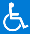


 Your cart